Studio Em Dash Work Projects Inquiry Ideas

The biggest problem we face when developing multiscript typeface family, originated from latin that includes CJK scripts, is the character size. When Latin Alphabet is typeset with Chinese, Japanese, or Korean scripts, Latin Alphabet tends to look comparatively small and it creates an unbalance harmony as a family.

So, why does the Latin look so small when paired with CJK scripts? Let’s start from looking at the anatomy of Latin Alphabet (I probably don’t have to explain this, since readers of this article highly likely are already type lovers, but bare with me for a while). Latin Alphabet has uppercase and lowercase; and while both of them are designed on a baseline, uppercase letters only occupies from above the baseline. The lowercase letters stems from x-height, and grows upwards or downwards from there. None of the characters occupy the space fully from top to bottom.

CJK scripts, on the other hand, are designed to fit in a monospaced box shared across the characters. This already creates a height gap between CJK and Latin, and furthermore, because more than 90% of the characters in Latin Alphabet sentences are written in lowercase letters, this gap becomes even more significant.
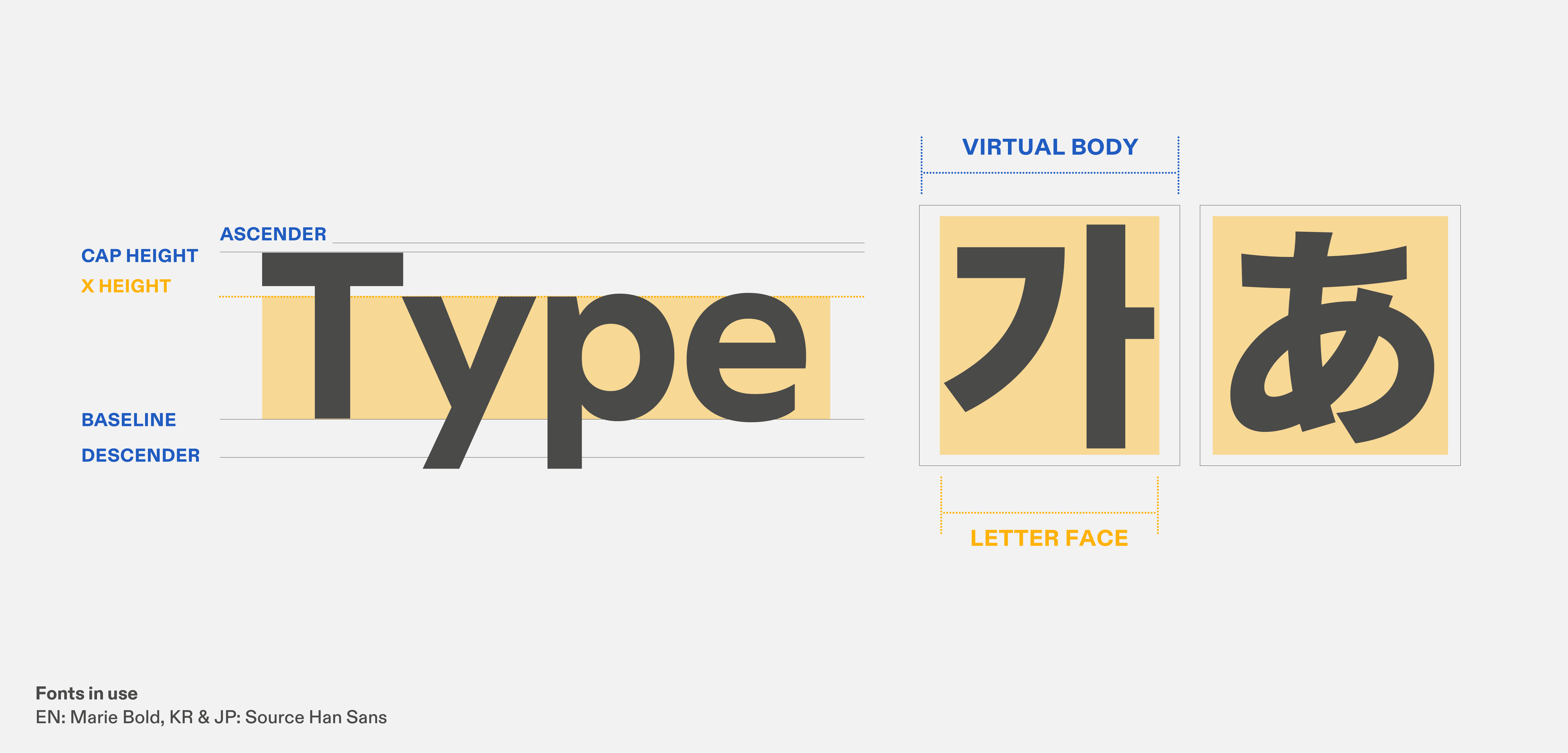
Japanese and Chinese typefaces are mostly designed in an embox (1,000 units wide). While traditional Korean typefaces also follow the same convention, modern Korean typefaces have adopted narrower width; from approximately 830~980 units wide. Due to this difference, the impact of character difference with Latin is pronounced.

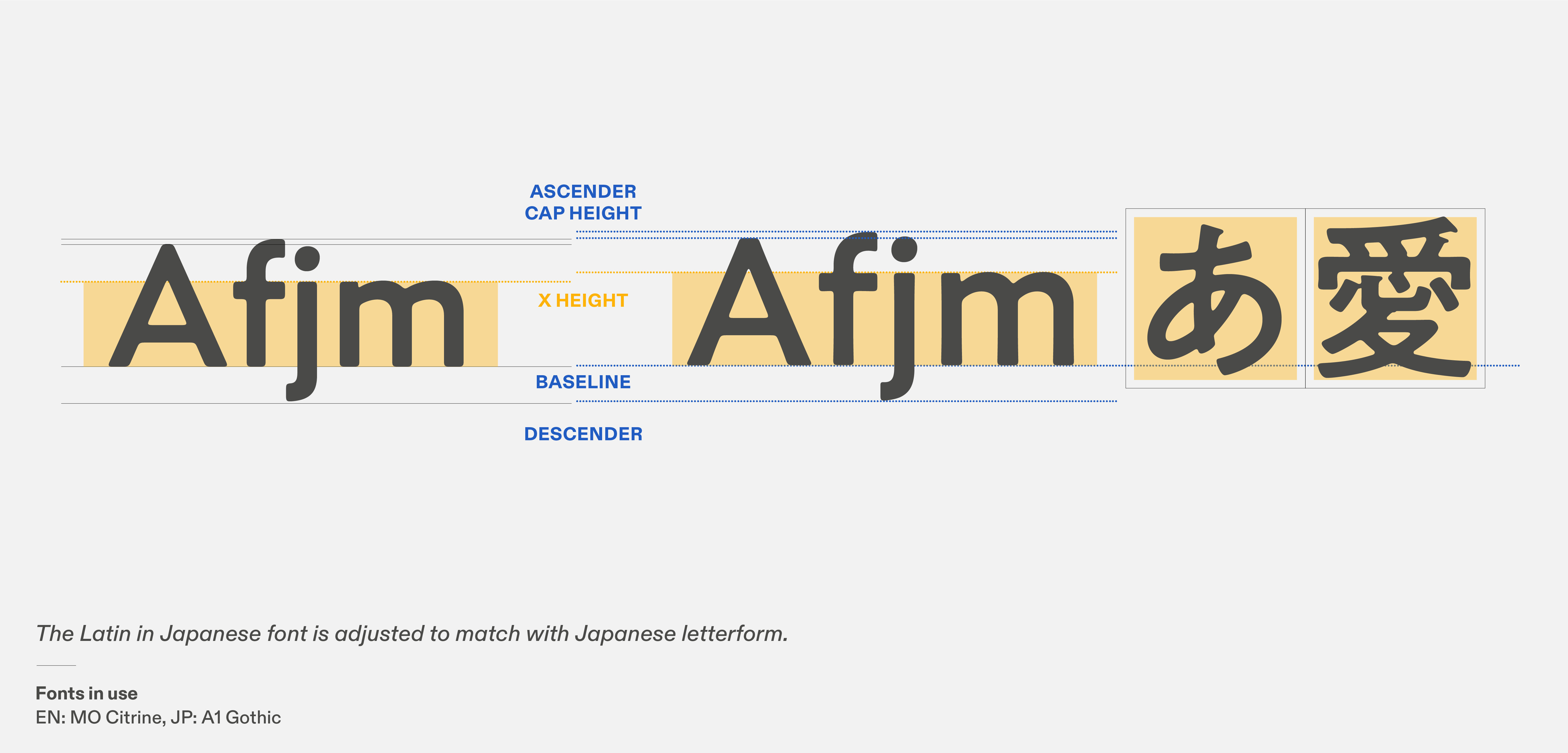
Japanese typefaces came up with an unique solution of creating a new Latin Alphabet standard that is compatible with Japanese letterforms – Hiragana, Katagana, and Kanji. Subordinate Latin has a lower baseline, larger x-height, and smaller ascender and descender compared to conventional Latin Alphabet. By this new standard, both uppercase and lowercase letters can look bigger than usual, whilst avoid interrupting linespace and CJK boxes with the ascender and descender. The downside to this subordinate Latin is that it is quite difficult to design beautiful Latin with this standard; as you can imagine, it alters the Latin letterform structure.

This is less prominent in Korean typefaces due to several potential reasons. First, Hangeul has less number of strokes than Chinese characters, even when it comes to the most complicated glyph. Therefore, the character size does not have to fill as maximum in the box as Kanji or Hanzi. Secondly, Hangeul is a block-composition letter with a single letter representing one syllable.

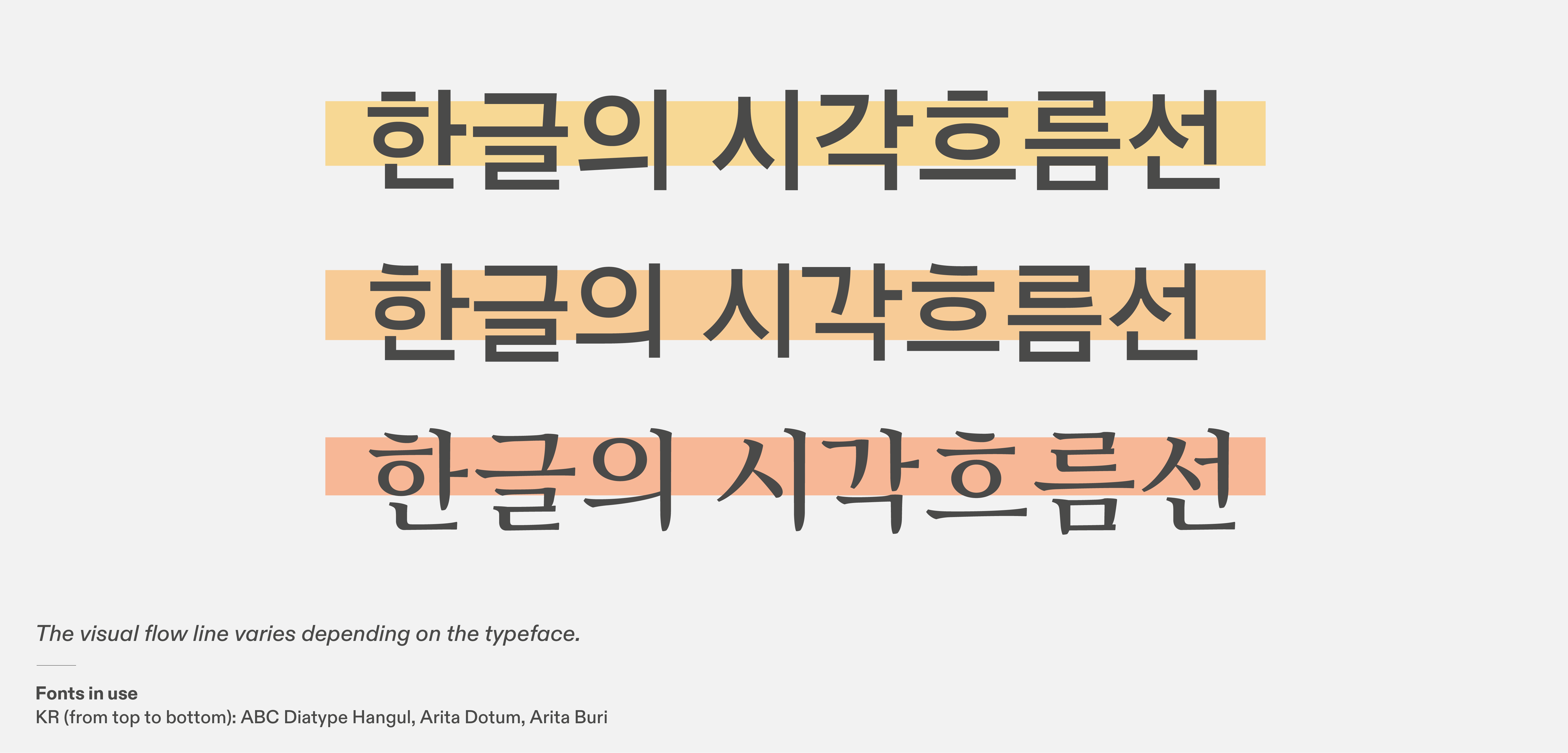
This means, some characters may have fewer components (especially on the bottom part of the character; called Batchim), and because the blocks get stacked from top left to bottom right, the Visual Flow Line of the character remains slightly on the top (See image below for more detail), and it keeps the center of gravity higher than Chinese or Japanese characters. Hangeul is designed in a monospaced box as well as C and J, so each characters do not scale as flexibly as Latin does, but due to this Visual Flow Line, there is a vague nuance that is similar to the baseline and x-height. It is still preferable to have a little bigger Latin with Korean, but not as significantly as Chinese and Japanese typefaces.

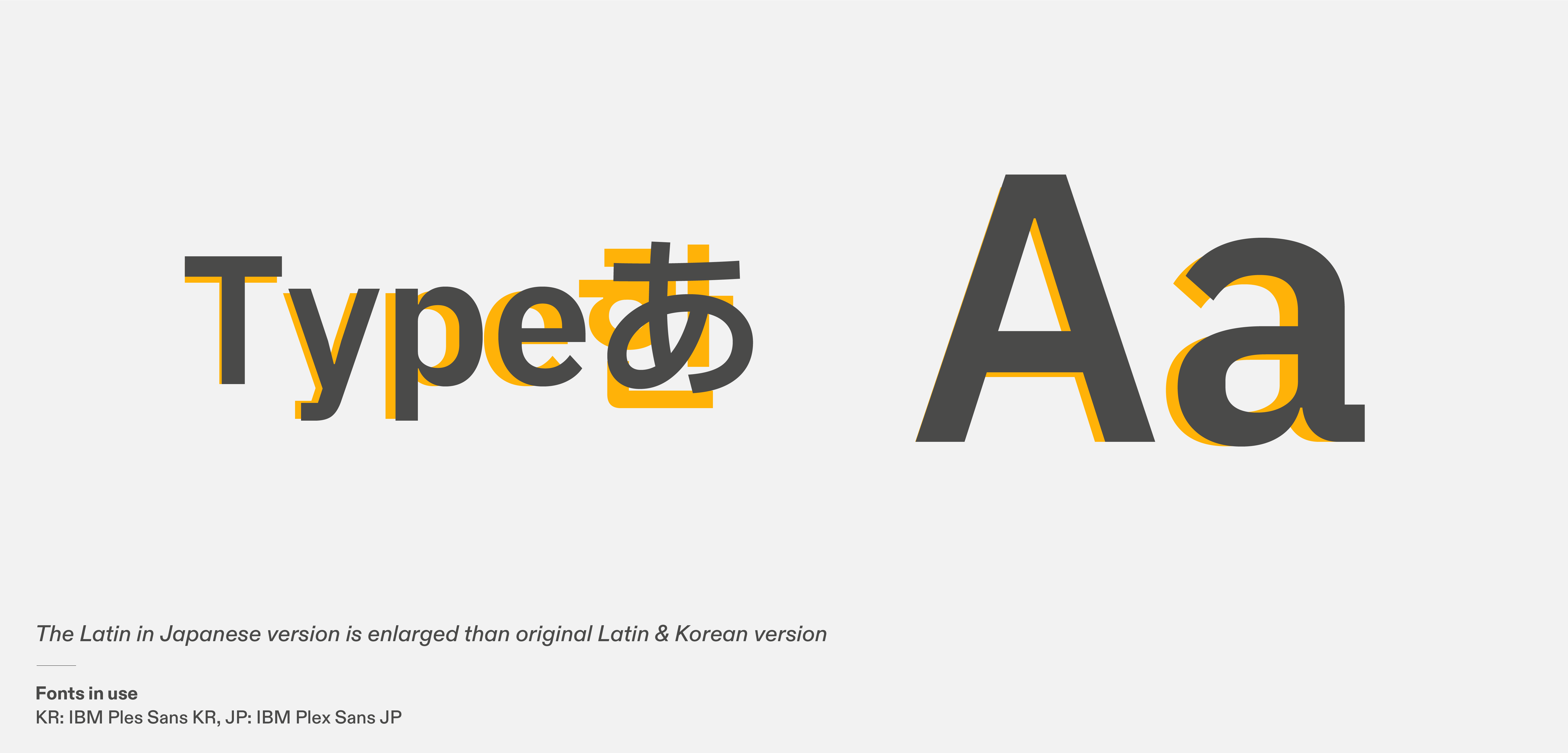
Now, let’s look at some examples. IBM Plex Sans has eight different scripts including Japanese and Korean. These scripts are made into separate font files per language. While this is very common method in developing multiscipt type families, IBM Plex Sans made use of this and implemented a separate set of enlarged Latin into Japanese version.

This way, they can pay the respect to the main script, Japanese, and also keep the size harmony with Latin. The possible problem is, when several different languages are written side by side, the enlarged Latin in Japanese text could stand out and breaks the consistency. If the typeface is being only used within the domestic designs and each language versions do not be written together, this problem could be avoided; just need to be careful not to accidentally typeset Latin with Japanese version.

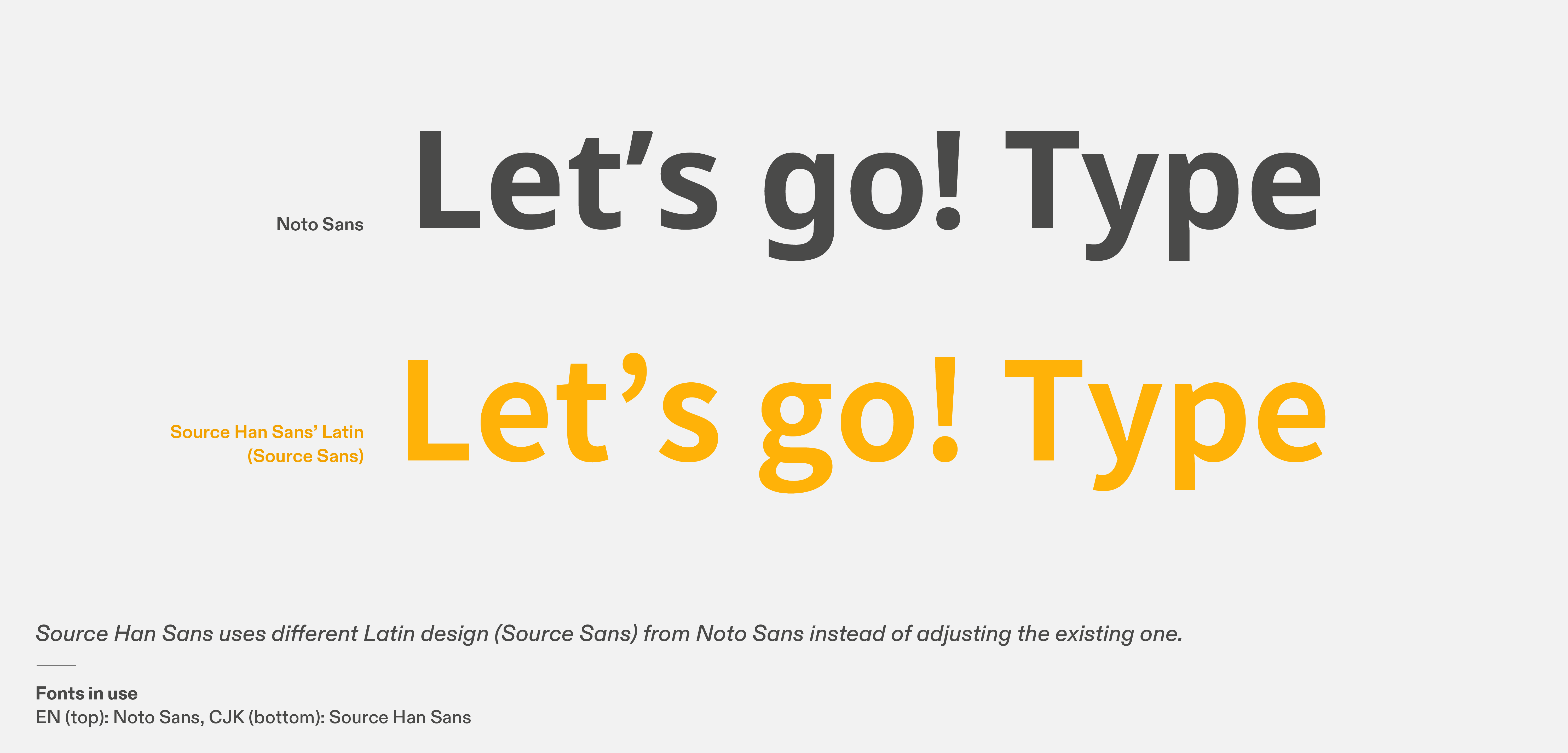
Source Han Sans is a different name for Noto Sans CJK, designed by Adobe. They have identical characters except for the Latin. Why does Source Han Sans and Noto Sans CJK have a different Latin design from Noto Sans, even though it’s a part of Noto project? The reason is simple – Adobe was already in progress of designing Pan-CJK typeface when Google approached them with the Noto Sans CJK project. The Latin counterpart of Source Han Sans was adopted from the existing typeface Source Sans, and Google decided to implement the whole thing including the latin, under the name of Noto Sans CJK, resulting in having a different Latin Alphabet design from other Noto families.

Source: blog.adobe.com/en/publish/2021/04/08/source-han-sans-goes-variable

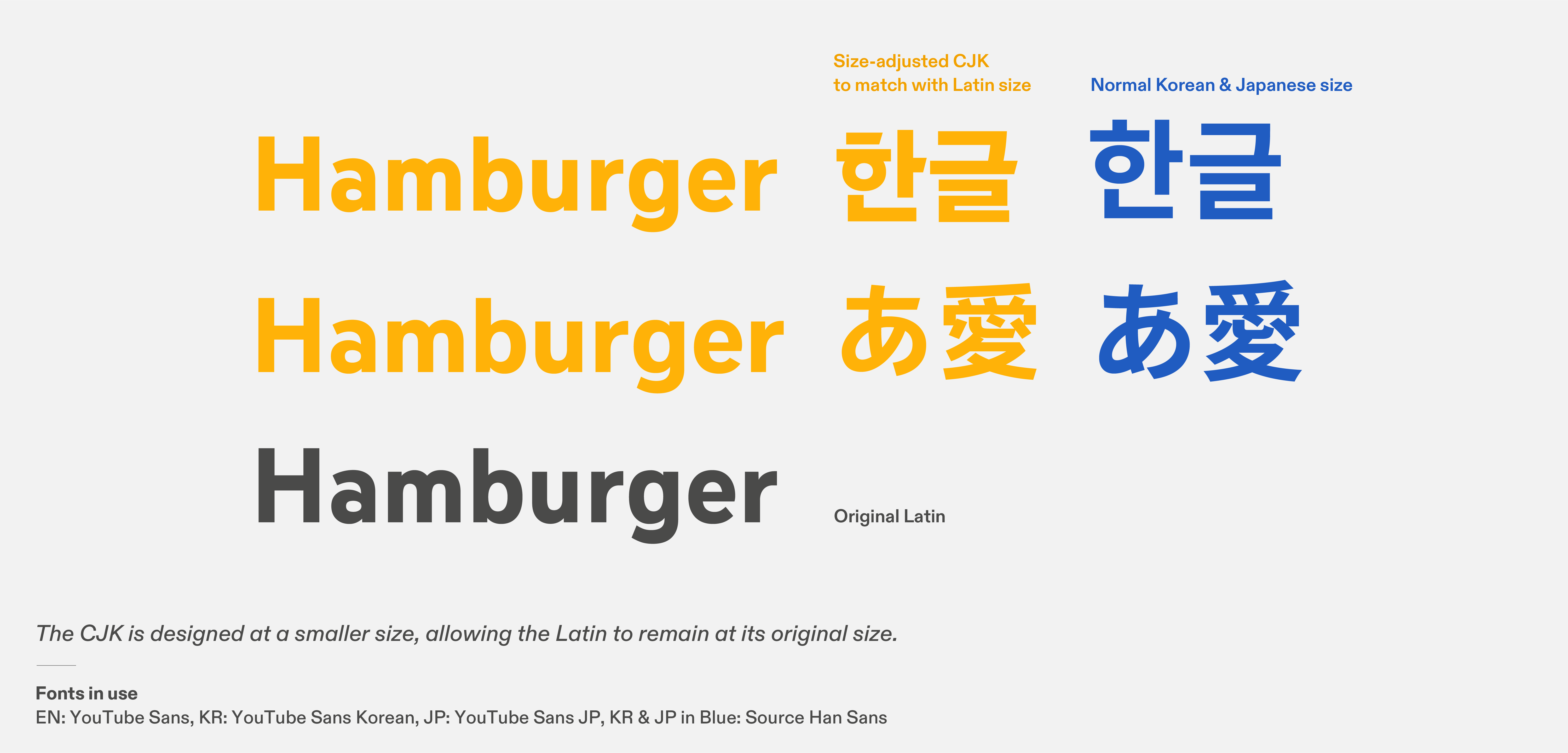
YouTube Sans is a corporate from designed for YouTube, and I led the Korean and Japanese expansion as a project director. Upon kick-off, the character size matter had to be discussed first, for the consistency of the whole multiscript versions. As a project director, my decision was to keep the Latin size and design Korean and Japanese slightly smaller than their usual genuine letterforms.

The logic behind this decision was that, when the company applies the corporate font in their UI design and marketing materials, a consistent design system will be maintained across all regions of the world, and only a different font files (scripts) will be applied. If the Latin size is not consistent throughout the families, there will be discrepancy in the design, since generally words in Latin Alphabet will be used together, starting from the corporate name “YouTube”.

And, the design system will be developed based on Latin – because the company is based in the U.S., the English speaking country, the smaller letterforms for Korean and Japanese will help sustain the typographical looks of the design system. (Additional Note 1: as we discussed earlier, Japanese especially tends to be bigger than Latin, so what happens if the letterform is kept as big as usual? Japanese will look huge and stand out in the design system).

This approach was possible because the Latin had generous counters and open terminals. (Additional Note 2: if the Latin counterpart fundamentally has a small x-height, there is only so much room for the CJK to be made smaller)

Special thanks to an amazing designer and a friend Mingoo Yoon, who designed YouTube Korean, Ayumi Kiryu, who designed the Japanese, YouTube team, and a friend and the best boss ever Dave Crossland

So, how do we harmonize Latin in CJK typeface? There is no one answer to this question. It greatly depends on the design of the typeface, where it originated from, what the most important element in this typeface’s design is, and beyond. Each typeface examples stated above has good reasons that match with their situation (or what they believed it matches at that moment). To figure out what is most suited and appropriate for your typeface, you not only need to understand each scripts itself, but also the linguistic attributes, historical lineage, typographic tradition and recent practices. Typography consultant is here for that matter – to help you find the best solution for your type project.